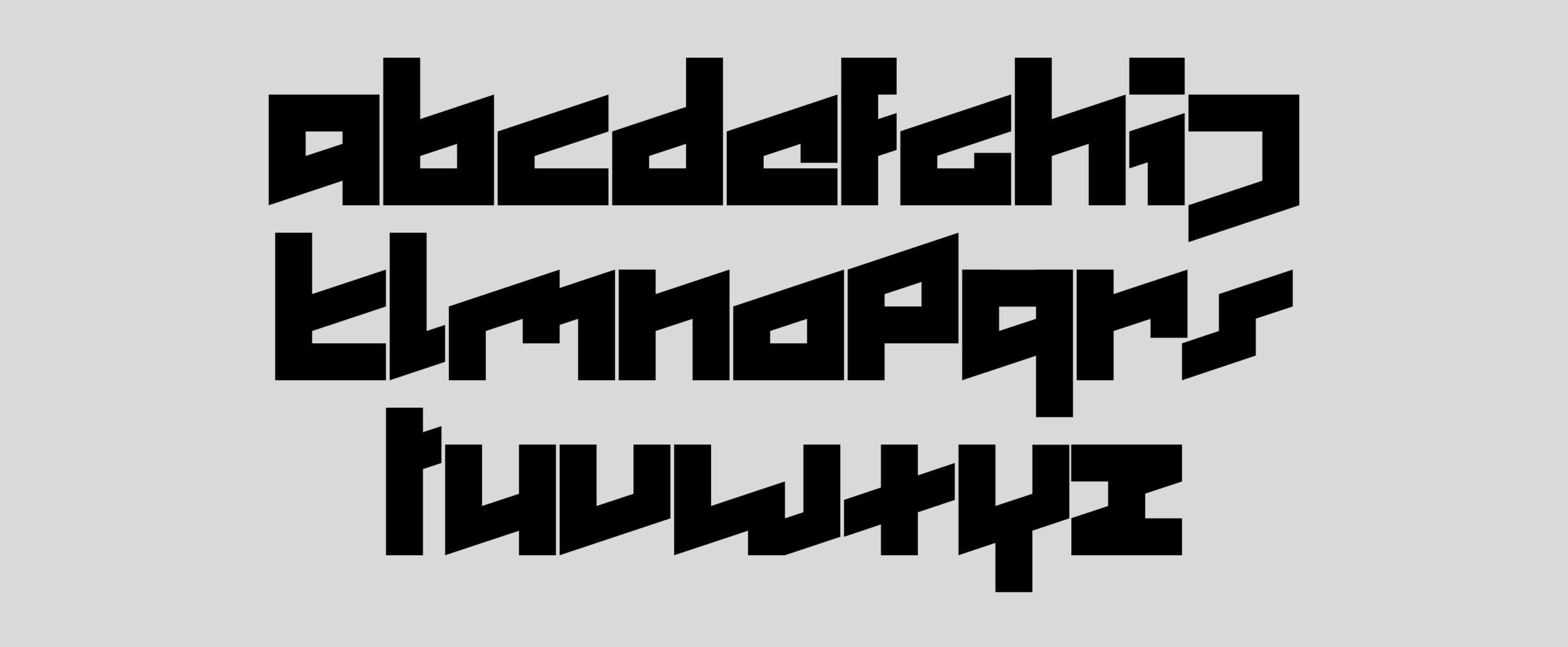
I created a grid in which each letter fits clearly. I abandoned the idea of a monospaced font in favor of one with three different widths, based on red guidelines (standard, half, and one and a half). Uppercase and lowercase merge into a single category.